

Presentation
What is it?
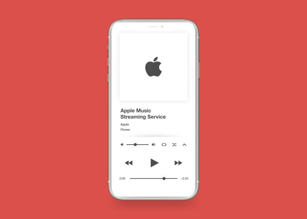
This project is a reimagined concept of Apple's music streaming application.
Why is it important?
In my opinion, the current application has usability uses that render the experience slightly tedious. This concept tries to address those issues.
The idea.
When it comes to a high-use application. The experience should be fluid and fast. Music apps tend to be used often, as the user becomes familiar with features, they may speed up their actions. This means that functions should be in easily memorizable spaces.
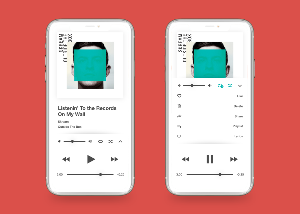
Working in context.
When using the music player screen, additional functions can be easily found within a contextual menu, this menu slides upward and features buttons in easily recognizable spaces. Also, the repeat and shuffle modes live on their own space. Because they are commonly used, I placed them in easy reach.
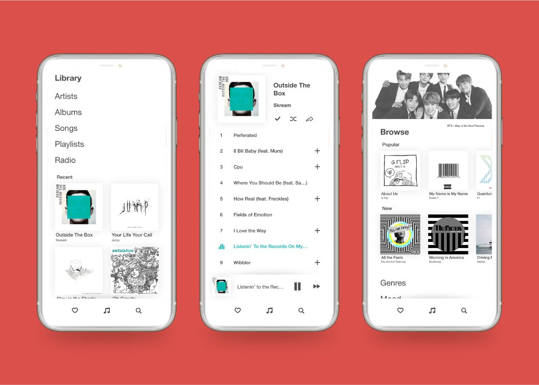
See the collection.
I have made viewing your music collection much easier. On your library page, categories are easy to spot and tap, as well as recently added music. When viewing an album, I reduced the amount of divider lines to limit clutter on the display. On the browse page, I worked to improve discovery and hide clutter that might overwhelm the viewer. Genres, moods, and more are nearer the top of the page to help focus discovery.

A world of colour.
With new IOS devices embracing colourful appearances, I believe standard Apple applications should detect this variance and adapt to the theme. This could help with the immersion of the Apple ecosystem.
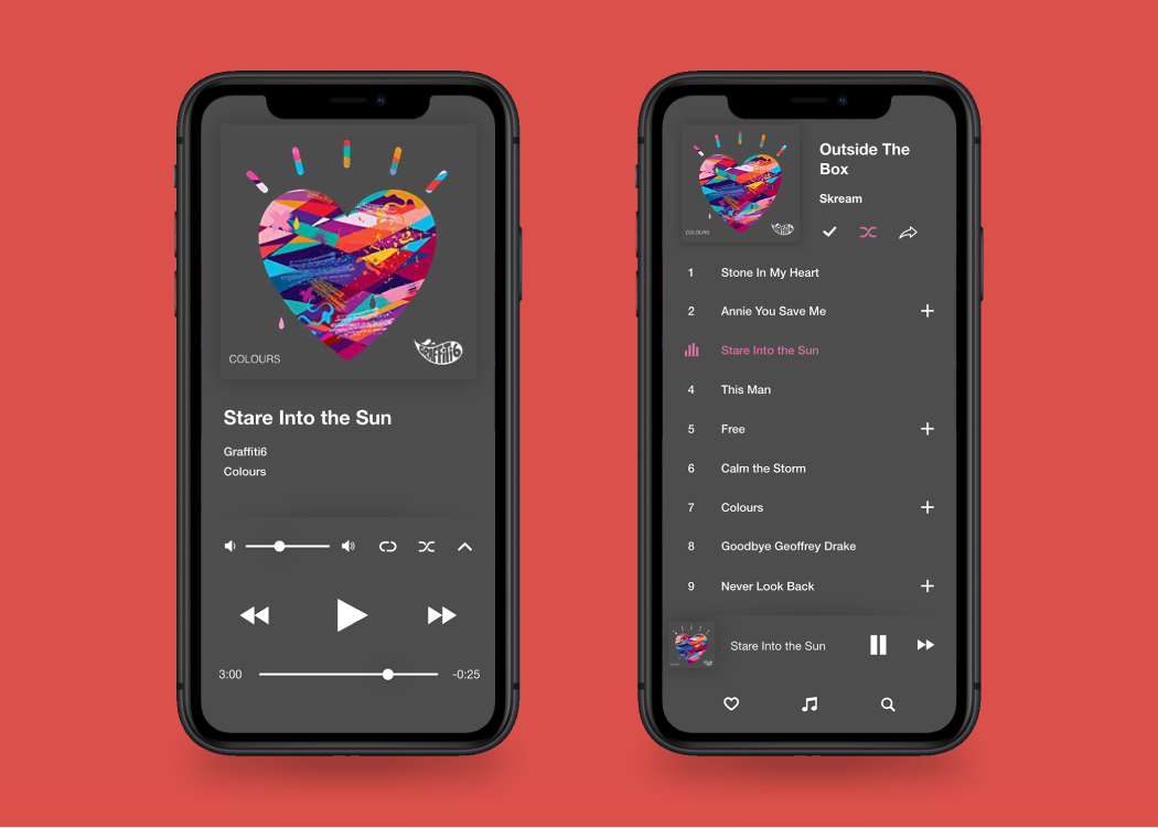
A light in the dark.
As dark mode is a standard feature, this new music experience improves on the older one by not being completely black, this keeps high contrast to a minimum while still maintaining a dim appearance; preventing stress on the eyes.
Conclusion
What I learned.
This project was an exercise in taking am already fleshed out idea and building off of it. I feel I learned more about colour, and more about the lack of it. I hope to do more concepts like this to expand my experience in interaction design.