Presentation
Learning something new.
The language of design changes frequently in our digital age. Now that more and more designers are sharing work, vast amounts of techniques and styles can be easily exchanged. The most recent development in style is that of deep flat planes with bright colorful gradients. I decided to practice this new style with an experimental project.
Iteration
Short and sweet.
This project was meant to be merely an exercise, so I quickly sketched some ideas out before starting on some screens.
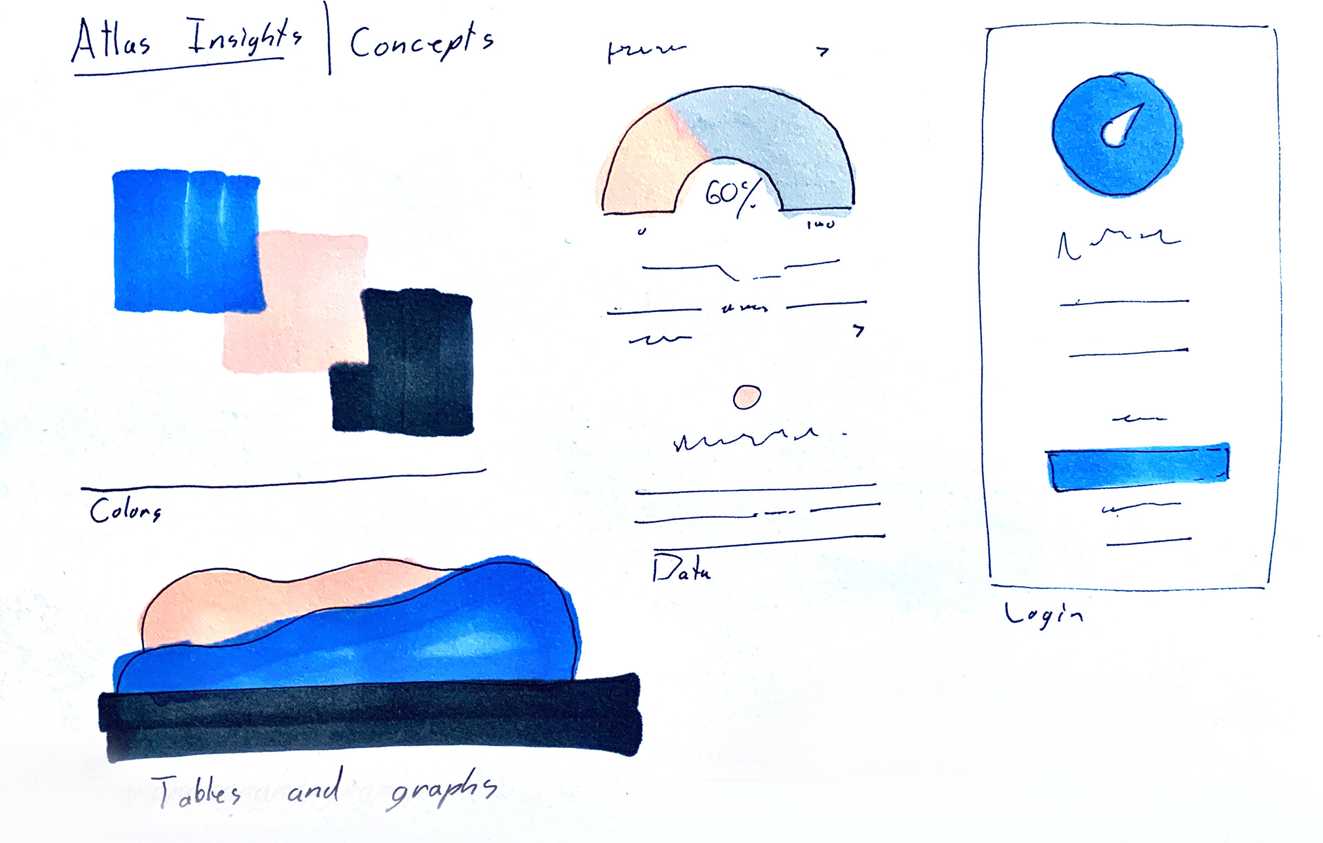
Sketch hues.
I took to my sketchbook to try and understand how this new style would work with business analytics. It was a little more challenging than I thought, but I pulled through and created some interesting shapes.
Choosing the hue.
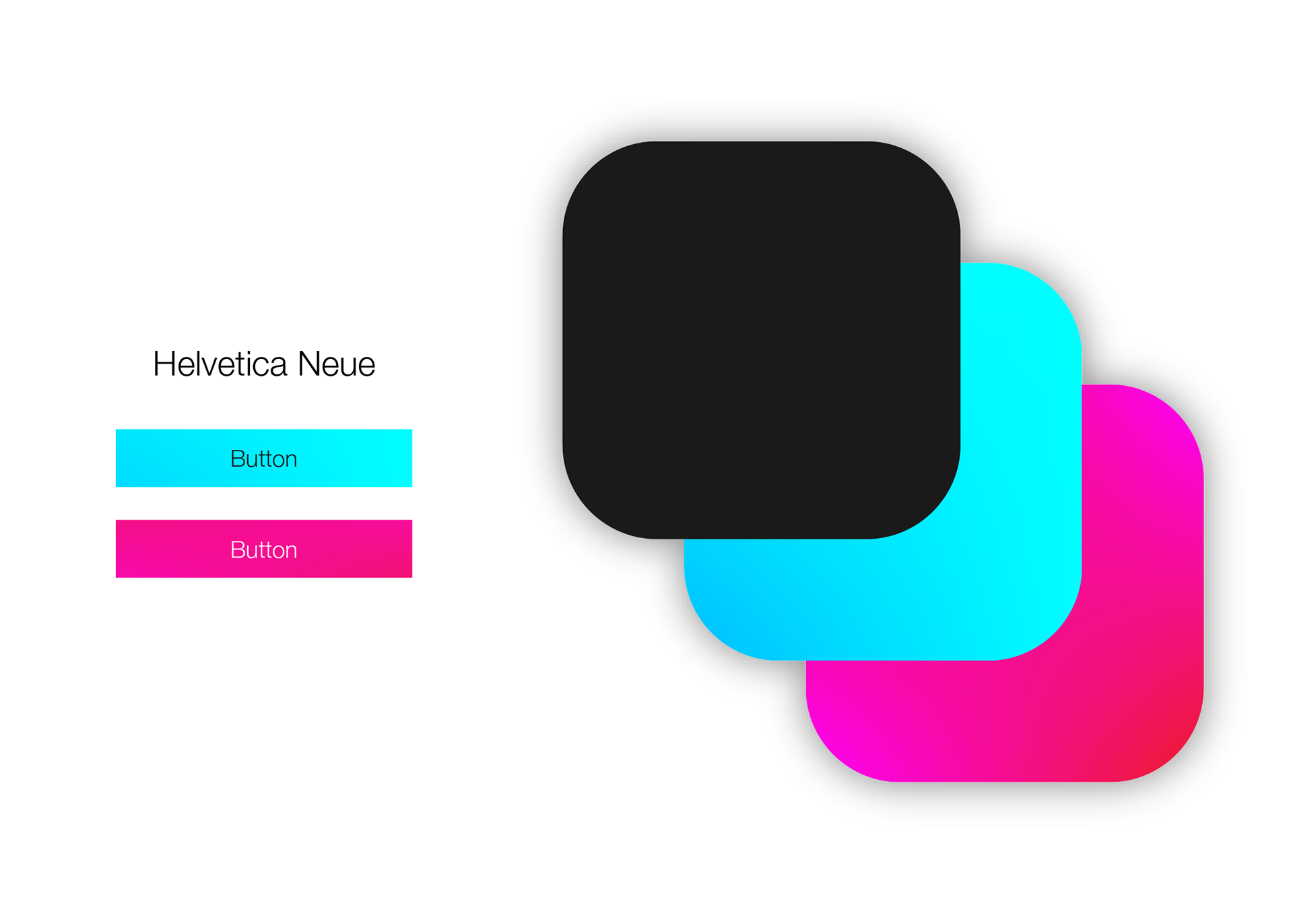
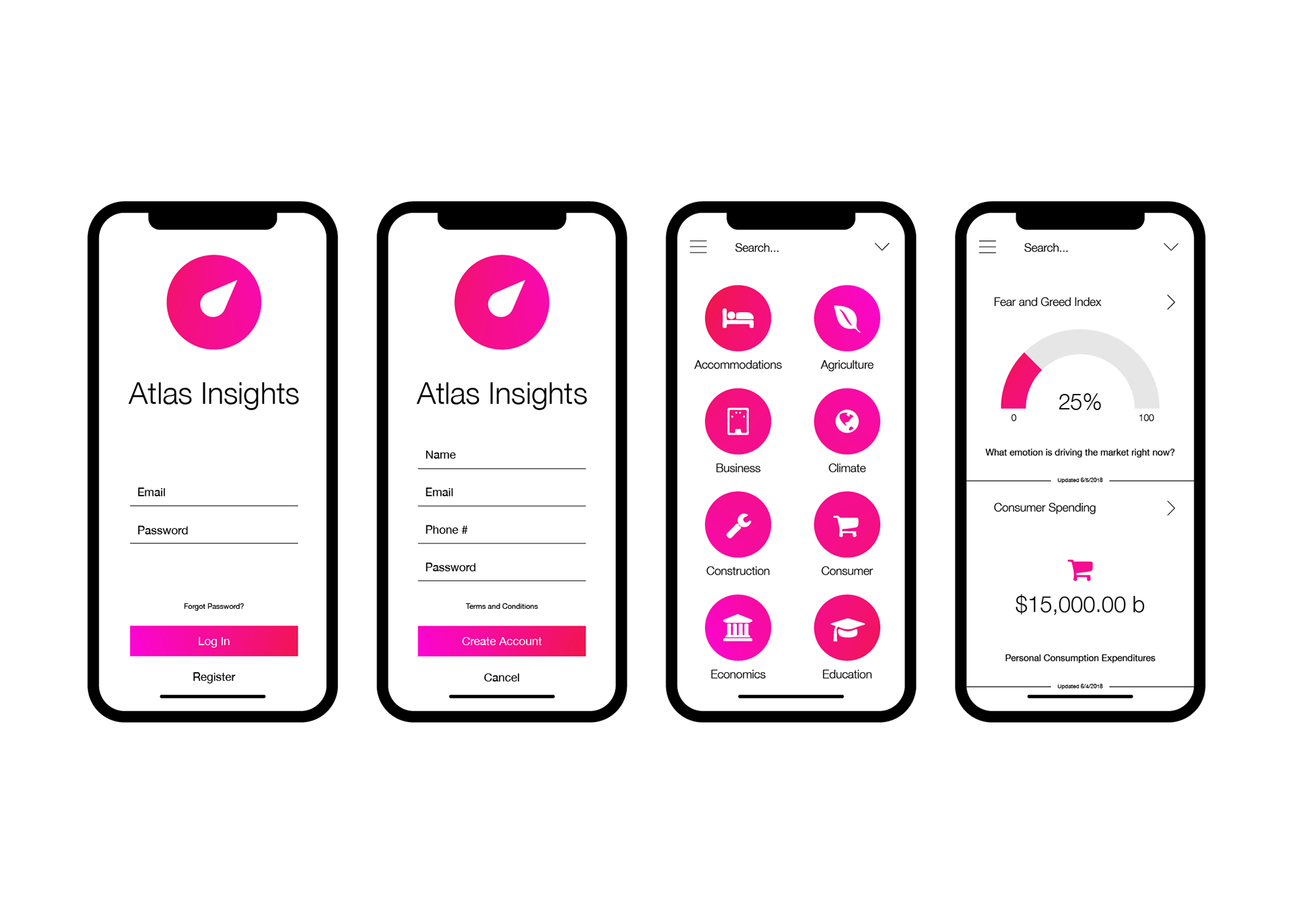
For this experiment I chose to work with some bright blue and pink gradients. I chose these colors because they can appear professional in either a light or dark setting.
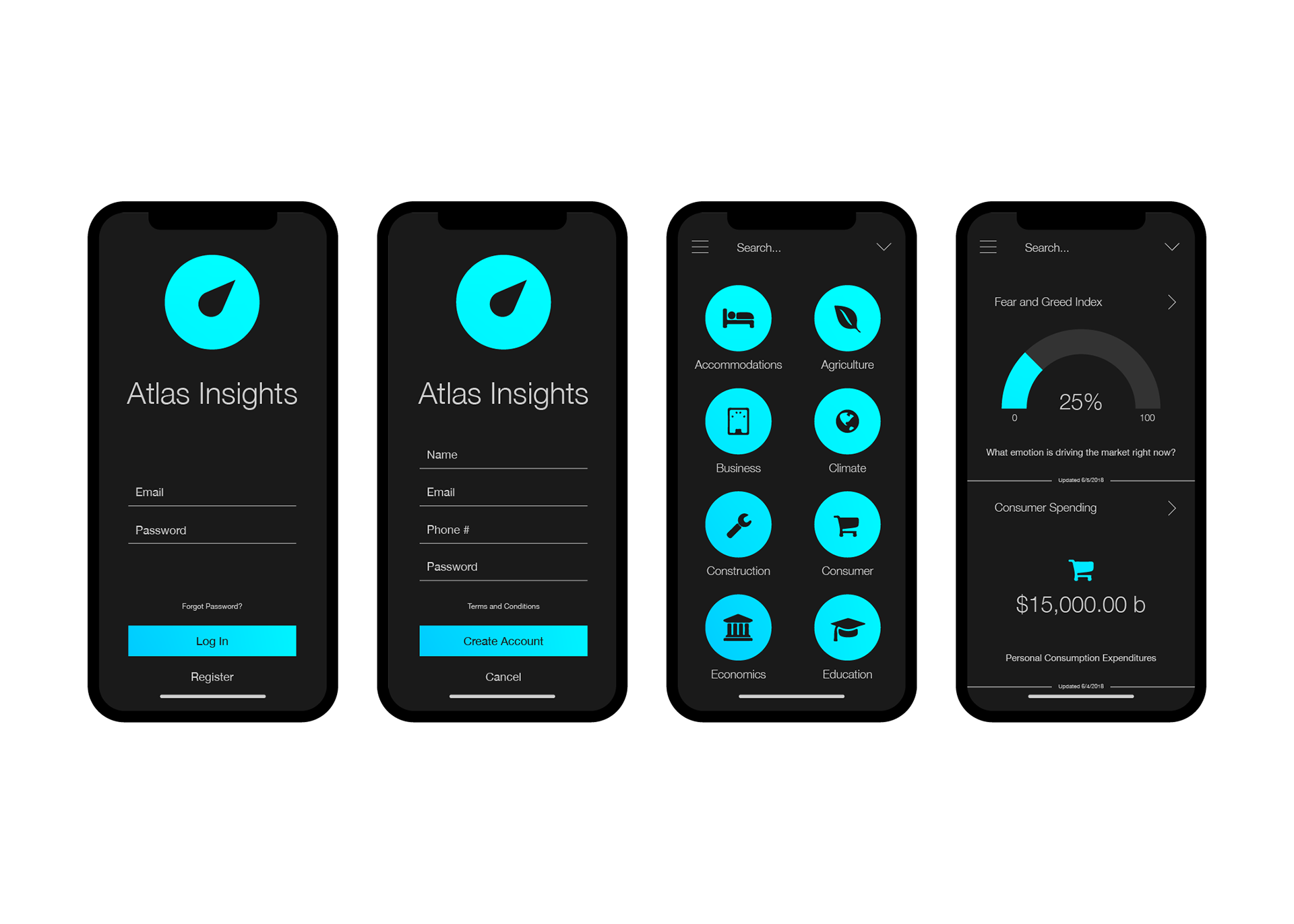
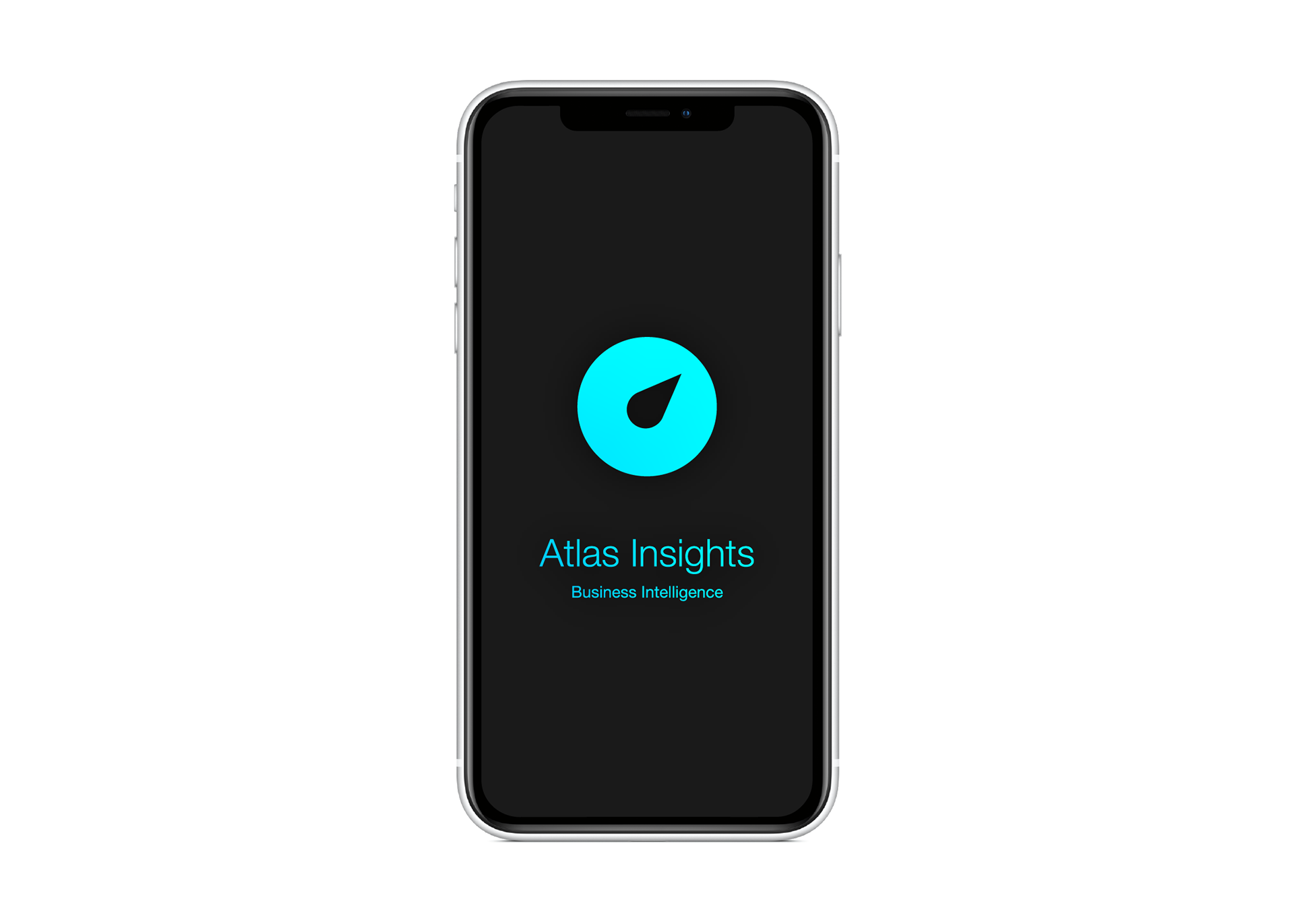
Dark mode.
The dark theme of the app features the bright, cyan-blue gradient. I believed this slightly cooler color would work better on the darker background because the contrast wouldn't be too hard on the eyes. This color combination reminds me of glowworms in a dark cave.
Light mode.
For the lighter theme, I chose the pinkish-red for the color offset. This combination works better in brightly lit areas because it catches the eye in a more intuitive way. Since the viewer's eyes will already be adjusted to a brighter display, it wouldn't be correct to use a cooler color. A cooler color would be too much of a contrast for the eyes to easily comprehend.
Conclusion
What I learned.
Creating designs based on big data has always been an interesting subject to me. This new "deep flat" style was a good chance for me to practice my technique as well. I thoroughly enjoyed attempting the look, and I plan to create some more to further hone my understanding.