
Presentation
What is it?
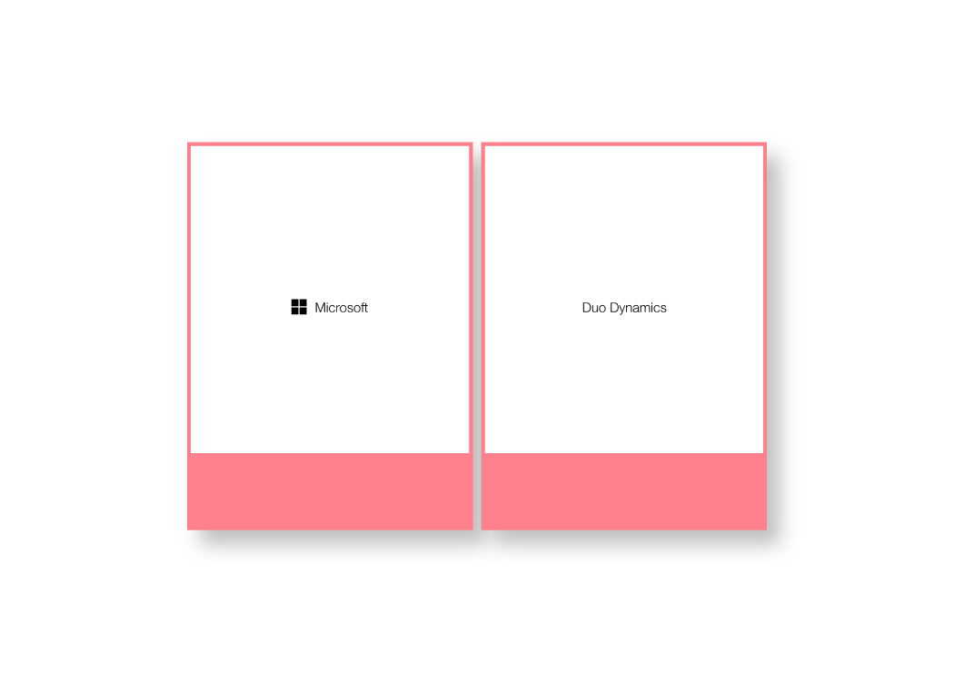
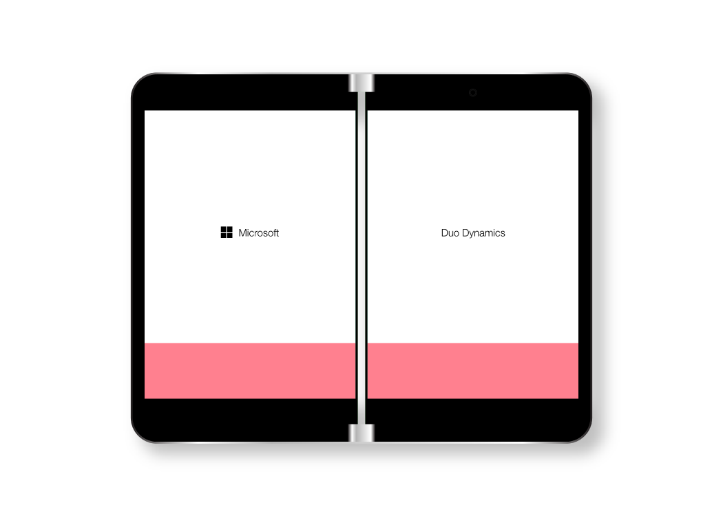
Duo Dynamics is an exploration of how Microsoft’s Dynamics software would appear if applied to the new Microsoft Duo and Neo folding devices.
Why is it important?
Microsoft Dynamics is essential to companies around the world. Providing a mobile platform that displays a lot of information on a collapsing silhouette would make the software much more accessible. The Duo and Neo devices are huge leaps in technology, and this project is a test to see how a data tool would work on their interfaces.
Interactive Mockup
Created in Adobe XD
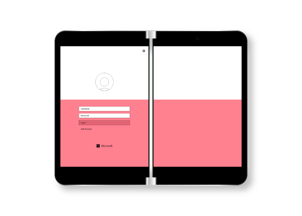
This mockup currently doesn’t support dual screens. I’ve worked around this simply by allowing you to switch to the right side by clicking on the gear icon on any of the pages. To go back to the left side, simply click anywhere in the app. Clicking on a non-interactive area of the app will display an overlay that shows you where interactive elements are. Click on “Log In” to begin!
Iteration
Starting the process.
The process of creating this concept was a learning experience for me. Having never made a concept for a dual screen device, I had to work hard to make sure information wasn’t repetitive or overwhelming to look at. To prepare, I did some user research into the potential audience for this app. For this concept, I settled on the idea of a shipyard app to display the power of Dynamics information display. NOTE: When creating this idea, I originally had two other ideas I was planning on developing, but due to feedback and market research, I determined that they would not be viable. To see these two ideas, please continue to the bottom of the page.

Mapping a path.
Next I created an information architecture map for the content I wanted to include in the app. Because of the dual-screen nature of the application, I summarized both screens in each entry.
Sketching ideas.
Using ideas and structure from my information map, I created some sketches and wireframes on how I believed that app would look. These sketches were rough and merely supposed to give me a basic framework from which to begin building my app.
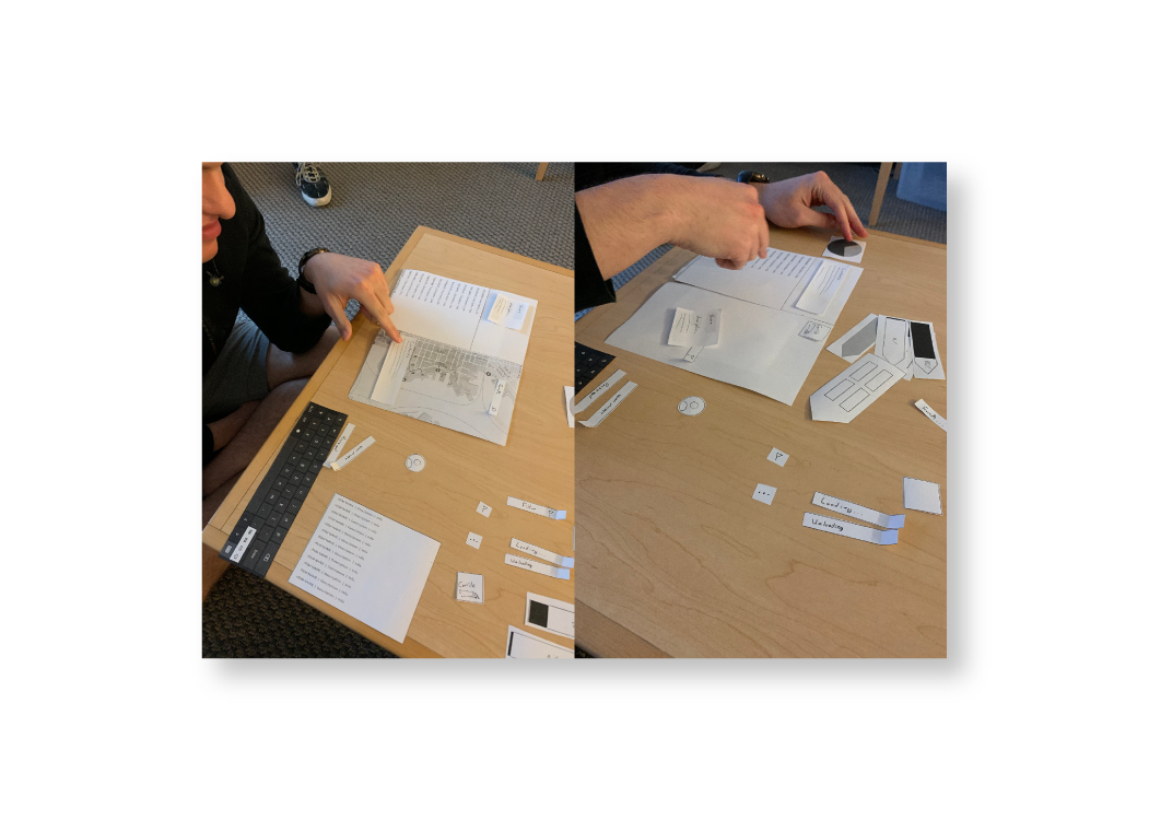
User testing.
To test my app idea, I created a series of paper prototypes and presented them to two individuals in the data analytics field to gauge their reactions and input. I was given incredibly useful feedback on layout and feature inclusion, and received advice on how I should present data on a mobile experience.
Creation
First steps.
Taking cues from my previous sketches, I created the first high fidelity mockups of my app. While building these, I used themes and colors from the current Microsoft Dynamics software.
After inspection.
After building these mockups, I realized that I was missing “character” to my design. The app had color, it had functionality, but it didn’t feel like it would be engaging to use. I set about trying to understand why it wasn’t working.
Finishing Touches
Execution
A stable, new footing.
After doing research into Microsoft’s budding Fluent Design language, I discovered that my Dynamics concept could benefit from it.

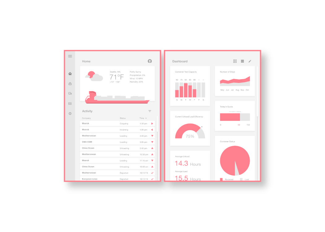
Home base.
Diving head-first into Fluent Design, I reimagined the app I worked on into a livelier, yet sufficiently organized look. The homepage on the left screen features easily readable information on the local weather and current activity from the shipyard. On the right screen, a data overview is displayed in the form of a live-updating dashboard. The user could customize this screen to better suit their needs.
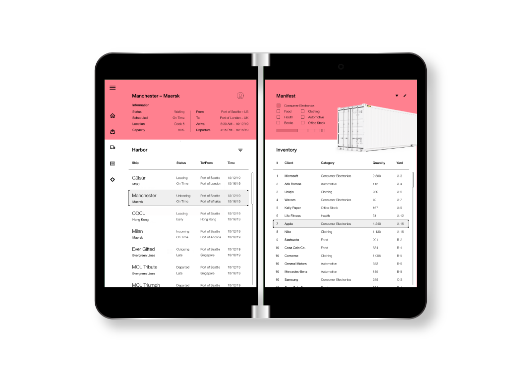
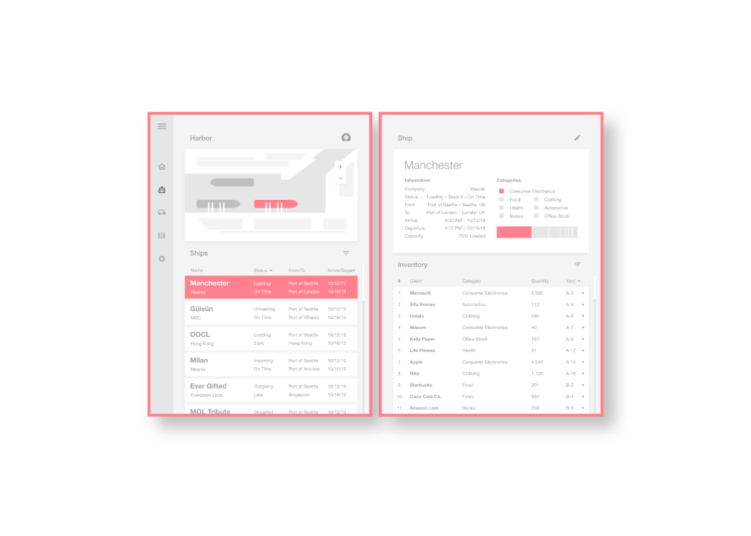
Harbor view.
The next screen displays information on different ships docked in the port. The left gives instant access to the name, status, destination, and more of each ship that is entering, docked at, or leaving the harbor. The right-side displays statistics and descriptions of the payload of a selected ship.
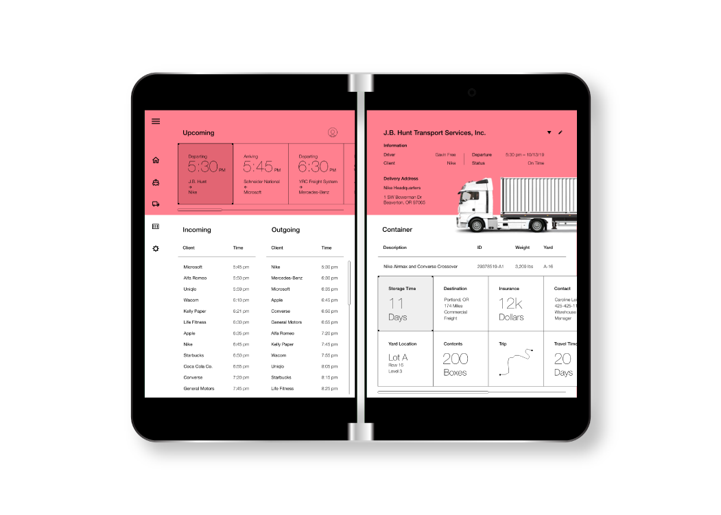
Data transport.
Following the shipping information is a set of pages detailing information on individual containers and their transport. The left side displays a series of information on the incoming and outgoing products and the right side gives a detailed feed on every detail that surrounds each container from the recommended route to the estimated value of the crate.
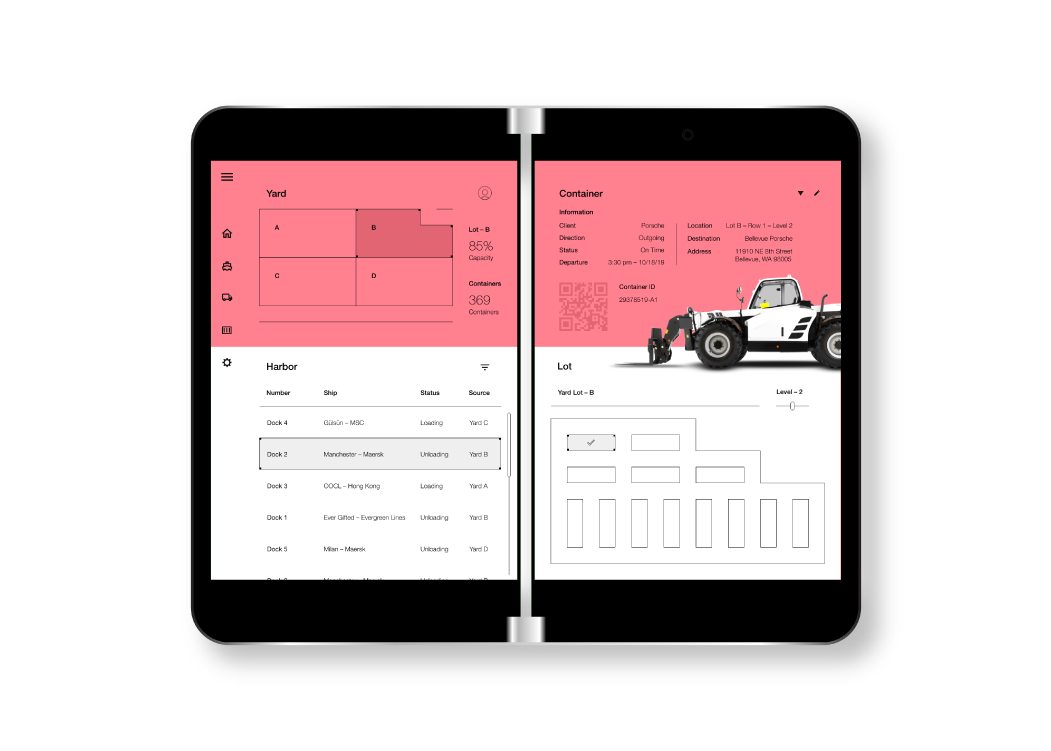
Yard games.
Finally, the last set of mocked up pages for this contact show information on the shipyard itself. The left side is a summary of the current dock usage and features a diagram of the yard for the user to select a section from. The right side gives locations and serial information on each container, making it easier to locate a product across the shipyard.
Conclusion
What I learned.
This project has been one of my best learning experiences about user interaction and mobile app design. Throughout the entire process, my preconceptions were reshaped in many ways, and I grew in my ability to do research and development.
Early stages.
During my initial concept development, I originally wanted to work on an idea for a recipe app and a piece of software that would hypothetically manage a holographically projected livery on a vehicle. While these ideas are novel, during a focus group I had with some fellow peers, I determined that these ideas were not viable for further development and were not problems that currently needed to be solved.
Going forward.
This project opened up my mind to the world of business applications and data analytics. I found that many of these applications are rising in importance and are becoming vital parts of the software world today. I hope to work more on data design in the future.