
Presentation
What is it?
This project is an attempt to revitalize Microsoft’s mobile Windows platform. Various standard features of most smart phone operating systems are explored in this exercise.
Why is it important?
Microsoft has attempted to launch their mobile operating system before with their “metro” inspired, tile-based experience. Microsoft’s tile interface was a creative deviation from the commonly used app icons from either Apple or Google. In my own opinion, the tile experience had great potential, but suffered from some unfortunate hitches in user flow. This concept below is merely my personal attempt to address these issues. Not every app or experience is featured, but enough to give a general idea of how a new tile-based experience could work.
Execution
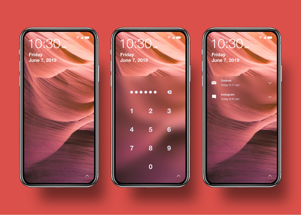
The Lock screen.
Microsoft’s Windows lock screen has always been strongly representative of the brand. Previously, the clock would have been positioned near the bottom left of the screen. I chose to move this towards the top left corner in order to associate it with the normal system clock location. Since users will be used to looking in the top corner for the clock, the location shouldn’t generally change in any way. The keypad and notification banners use the acrylic style from the new Fluent design language.
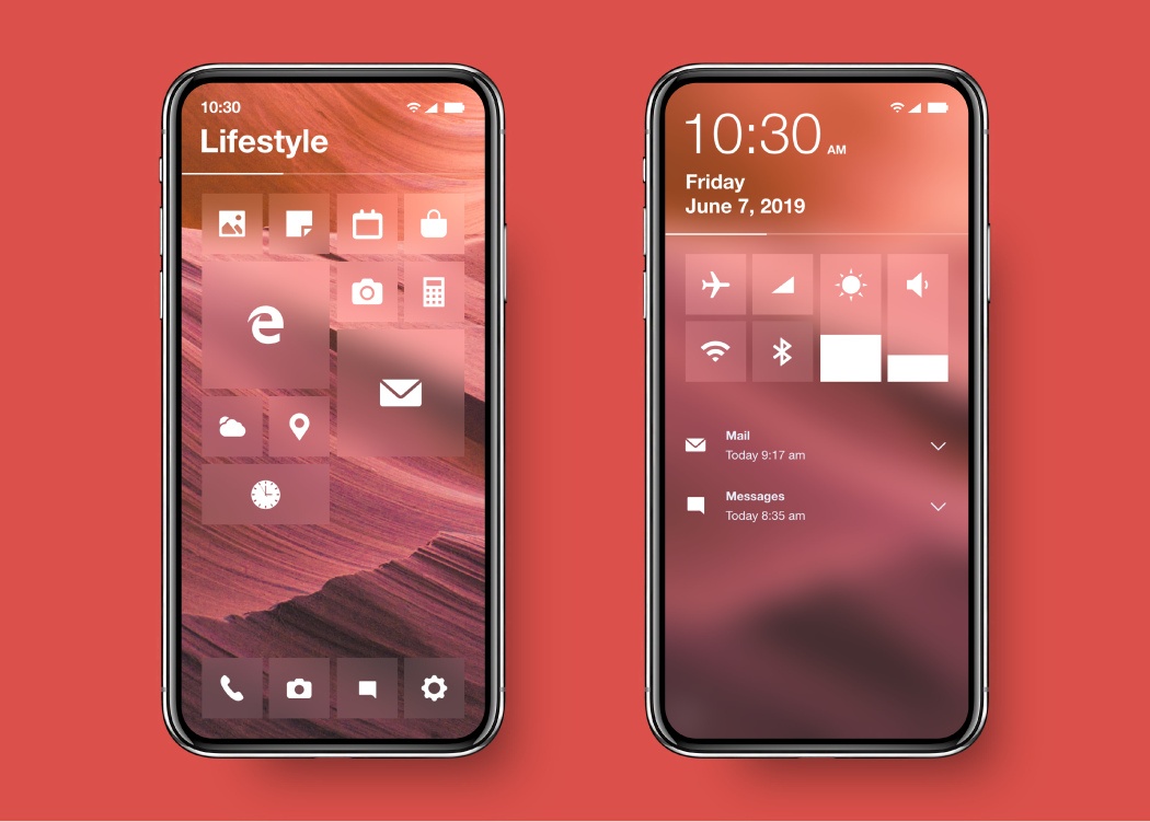
The Start screen revisited.
Swiping up from the bottom left reveals the new Windows mobile Start Menu. My idea for a mobile Windows start screen abandons the vertical scrolling mechanic that the official versions of mobile Windows OS used. Instead, the new Start screen uses a page style organization feature. A user scrolling a home page that contains many apps may have trouble following the individual icons, thus losing their place on the page. This new layout keeps that from happening and opens the opportunity for each page to be named.
Start stylization.
This start screen also does away with the previous wallpaper system. Some users find customization features incredibly important and choosing a wallpaper on your phone is no exception. The original OS either placed the wallpaper behind solid tiles or masked the wallpaper inside the tiles while making the surrounding background a solid color. This resulted in a fragmented wallpaper that may have been difficult to view. As a solution, I have chosen to make the tiles semi-transparent. This keeps the tiles from interrupting the view of the image.

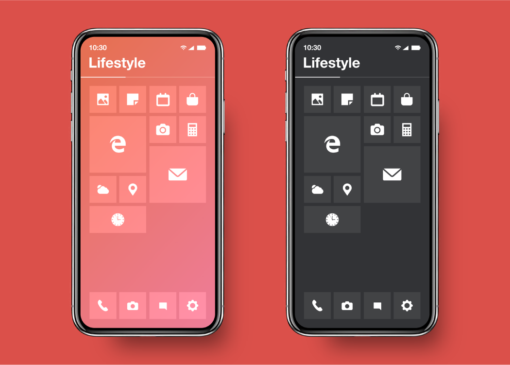
Color options.
The user could choose whether they want to use an image, a solid color, or even change the start menu to react to the time of day. Options could theoretically allow tweaks to the brightness and blurriness of the wallpaper and tiles to allow the user to make the interface look exactly how they want.
App management and use.
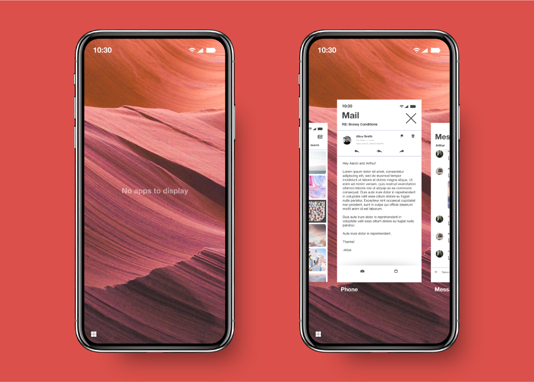
Swiping up from the bottom right reveals the apps that are currently in use. I hope to improve on this experience by adding an easily used multi-tasking solution. After swiping to see the apps, a user can tap and hold on one of the screens and drag it up or down into the slot they prefer. This allows them to then select another app and display both at the same time.
Demonstration
Various application examples.
Below are a few examples of how apps could be displayed in the new OS. You will notice a common theme of minimalism and the consistent use of white space to control feature boundaries rather than hard edges.
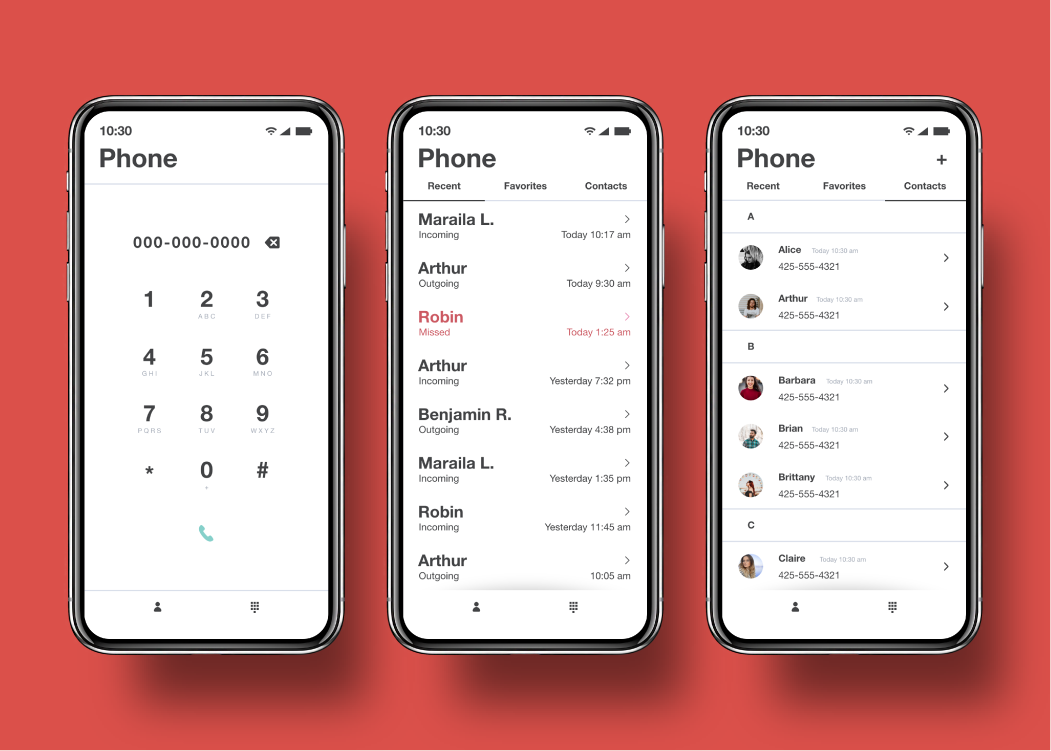
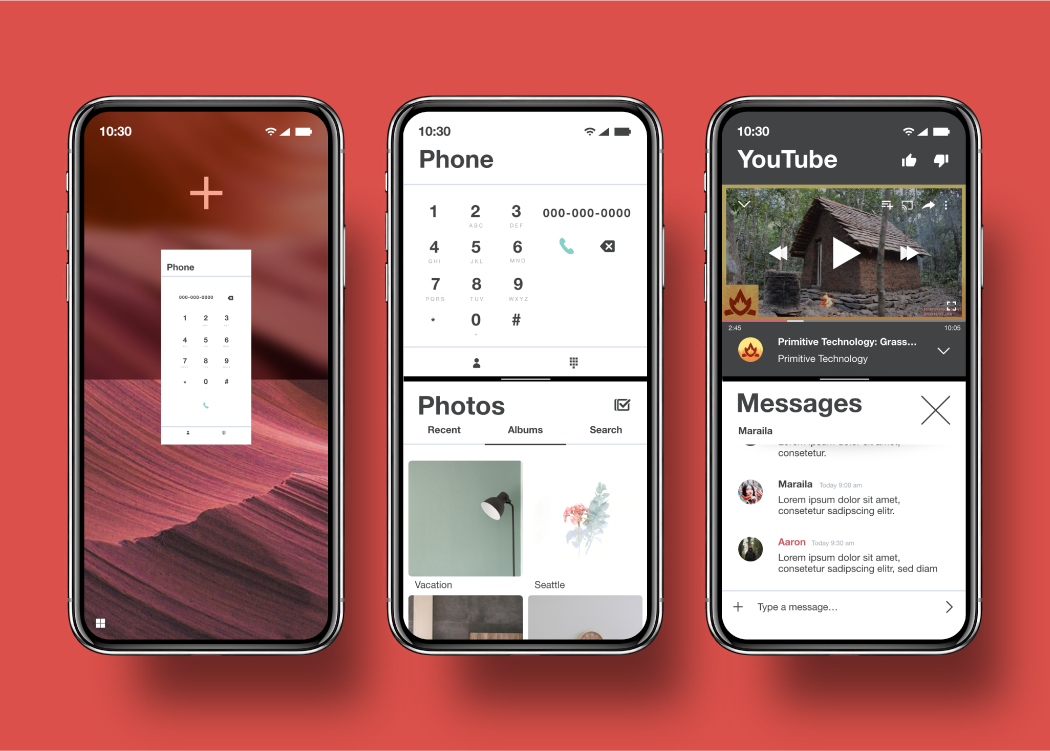
Phone and calling.
This is a phone application example. Highlights of this are the uniform spacing of all button elements as well as white space dividers instead of defined keypad buttons. To navigate the app, main categories are featured at the bottom of the screen, while sub-categories are aligned across the top. To denote that a page can be scrolled, a solid line changes into a no-line, shaded border. Having the shade taper off near the edges of the app gives the illusion that the bottom menu bar is being lifted like a piece of paper. Elements like this give the application dimension and a tactile feel. Notice that each element, such as a recent call or a phone contact, are bordered by white space unless separated by a category, which in this case takes the form of a letter.
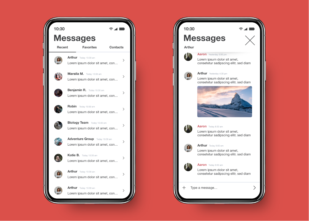
Text messages.
Similar to how the phone contacts are organized, message conversations are separated by white space. The main change to the texting experience is the new layout featured within the messaging space itself. Instead of staggering the messages on the left and right, the view stacks them all on the left, relying on color to separate messages from different individuals. This solution can make it easier to follow a conversation in the moment, since the eye may not need to jump from a right to left justification. This style takes inspiration from other chat applications such as Slack or Discord. This format also can allow images to be shown at their native ratios, instead of resizing to accommodate messages coming from either side.
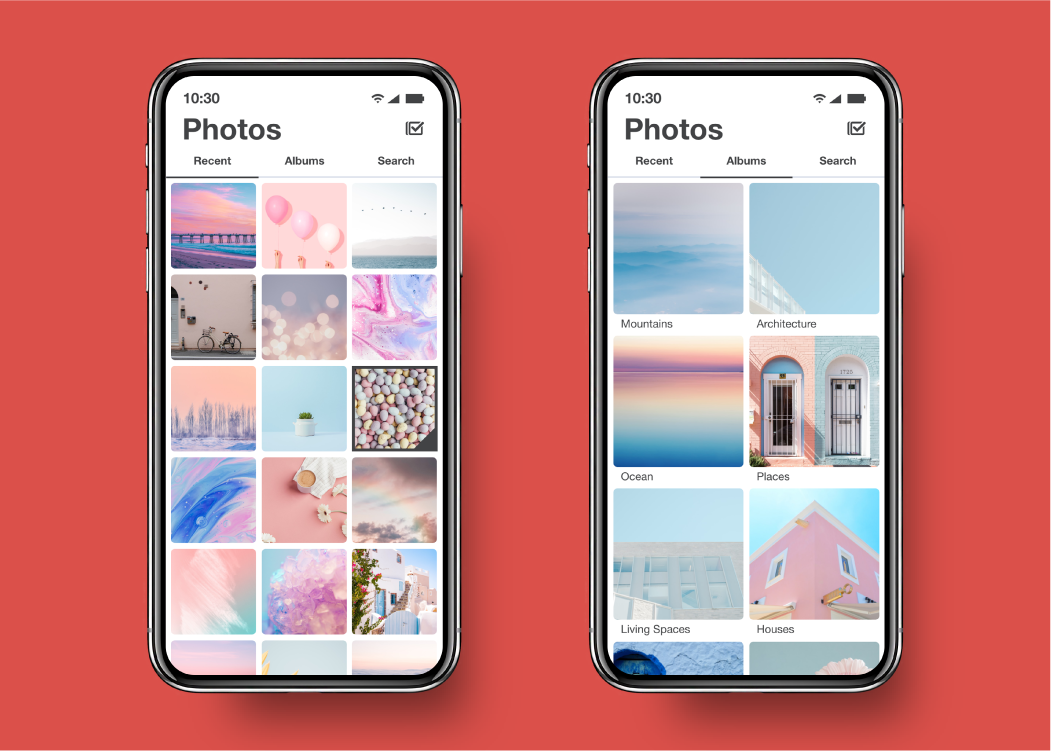
Photos.
The photos application experience is meant to be as simple and fluid as possible. Pictures are displayed in a simple grid with no interruptions of a bottom menu. This hopefully will provide the user with greater immersion into their photo library.
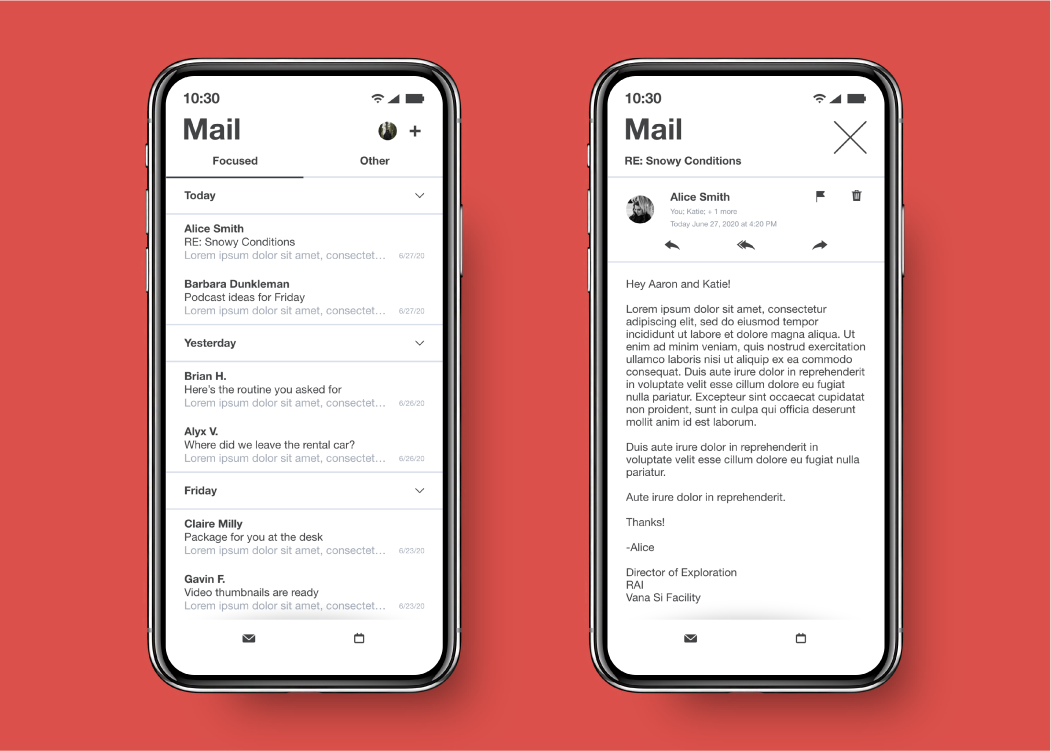
Mail.
Once again, this example of a mail application takes inspiration from the borderless designs from before. Because this is the stock mail app for the phone, the goal of the design was to be as efficient as possible. Controls for deleting, flagging, or replying are out of the way of the typing and reading area to prevent the user from possibly tapping them while composing or reading a message.
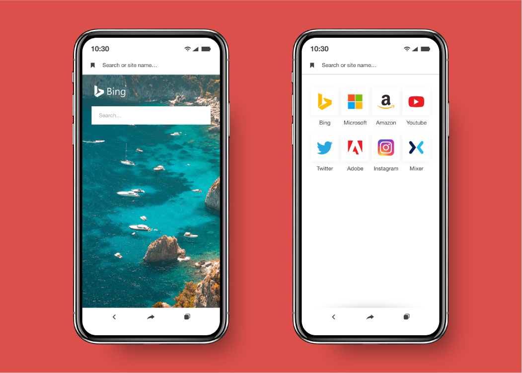
Edge Browser.
The Edge browser experience is crafted with a mobile experience in mind. Buttons are organized based on purpose. The bookmarks and search bar are found near the top, since those deal with the same function of directing the user. They are located near the top because the navigation functions they perform can drastically de-rail the user if they are accidentally used. The back button, share button, and tabs are found near the bottom, similar to how main categories are used in other apps. Bookmarks are displayed like tiles to stay consistent to the tile theme.
Conclusion
What I learned.
This project was extremely helpful to my knowledge of app design. I did not realize the sheer scale that an operating system resides on. Changing one feature can vastly influence the style of many other features. It is extremely important to understand consistency as well.
Microsoft may or may not decide to revive their mobile operating system, but I think its absence has given me an excellent chance to improve my user experience design skillset. This concept is ongoing, and new additions may be added in the future.