
Presentation
What is it?
This is a conceptual mobile app for Orca Transit in Washington state. Orca offers a service for a universal payment system for public transportation. This app is an alternative to the official website for loading the card with funds.
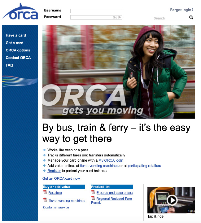
What is the problem?
Orca's current site is dated and difficult to understand. It is also tedious to load your card's balance from your phone if you do not have access to a computer. This app makes the loading process less of a burden. This increases a customer's willingness to make use of public transport. As a result, this not only improves traffic conditions, but is also better for the environment.
Iteration
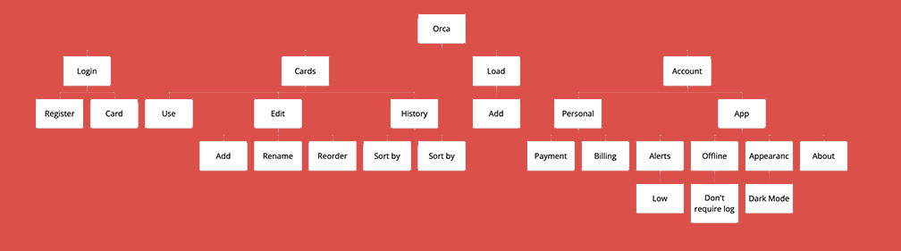
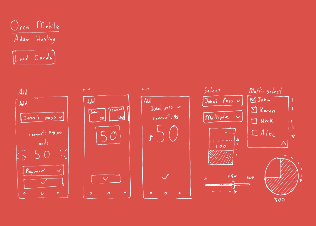
Mapping.
First, I created a map to see what features I wanted to include in my concept. This made sure I stayed on track
Philosophy.
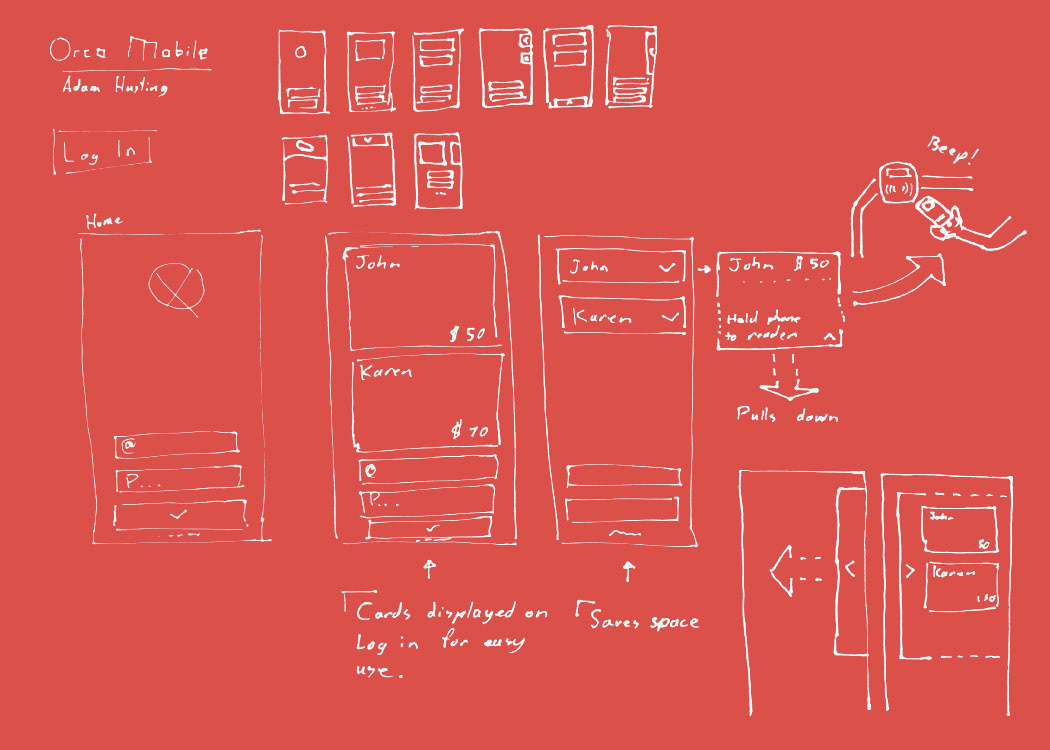
How is the customer going to make use of this application? I created a feature that allows people to use their card with their phone. Since everyone has a smartphone, it makes use of the Orca service much easier. This could even render the cards obsolete in most cases, which will reduce the amount of plastic waste created by this service.

Easy to use.
The app is intuitive in its function. The features are easy to see and access. There is little clutter, which prevents accidental inputs.
Refill with confidence.
Unlike the desktop website, this mobile solution makes the balance loading service easy to understand.
Execution
Manage your credentials.
All account details and sensitive information can be found in one place. This allows the customer to easily add or change details as needed without having to search.
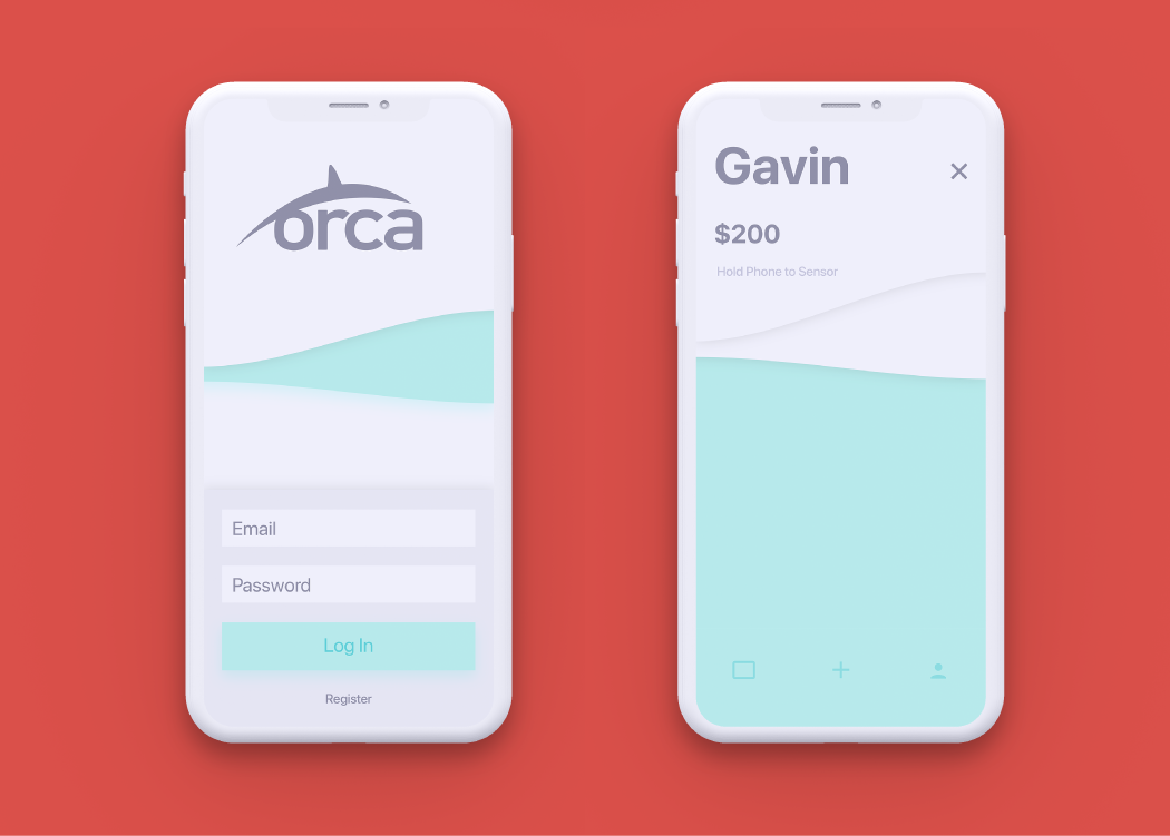
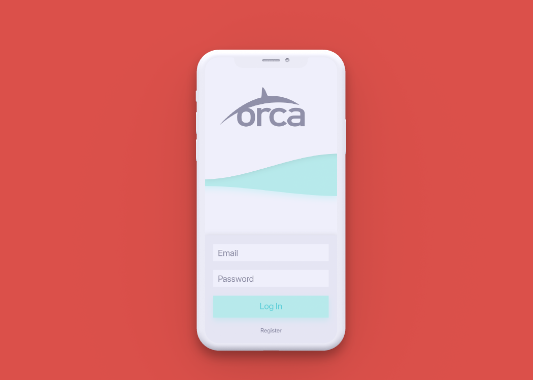
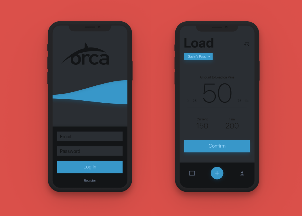
Login and use.
The login screen sets the standard of simplicity and style for the rest of the application. Pictured on the right is an example of an online pass. While this pass screen is active, the customer could theoretically swipe their phone across the sensor of their transit option.

Pass library.
Here is where your collection of passes is kept. One mobile user can manage multiple passes on this screen. The edit button allows the user to edit the names of the cards and organize them to their liking. There is also a history button that will show the past uses of any cards.
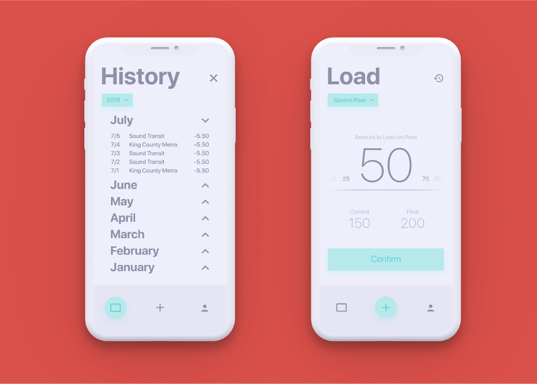
Concise records.
The app keeps track of each swipe of the card. It is organized tastefully, making the list easy to understand and reference. Pictured on the right is the fund loading screen. The interface is bold and keeps the user informed on precisely how they are loading their passes.

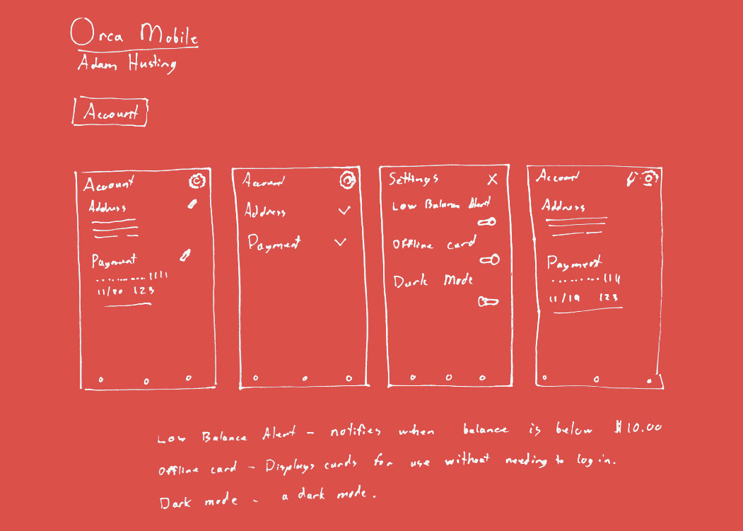
An honest account.
Here, the user can manage their profile and settings. The options are clearly highlighted and explained, so that there is no confusion.
Easy on the eyes.
The app even features a night mode, so that customers who find themselves loading their passes last minute, or using transit at night, can utilize the software comfortably.
Conclusion
What I learned.
This project taught me how to create a UI with fluent design principles. Over the course of building the concepts, I was able to expand my knowledge of styles that were not in my comfort zone. As a result, I now understand better techniques for color.
I feel that I am now much more open to styles I originally would not have attempted to replicate. I feel that I became much more rounded as a designer. I also learned about how transit helps the environment by removing significant amounts of its riders' carbon footprints.