
Presentation
What is it?
Paint mobile is an experiment for minimal ui for a commonly cluttered app environment. Many painting and drawing apps have too many features, and therefore defeat the possibility of a "quick doodle."
What is the problem?
Creative drawing apps are too busy. Too many features in a mobile app distracts the user from the activity. This app solves that issue, incentivizing the user to spend more time in the app itself.
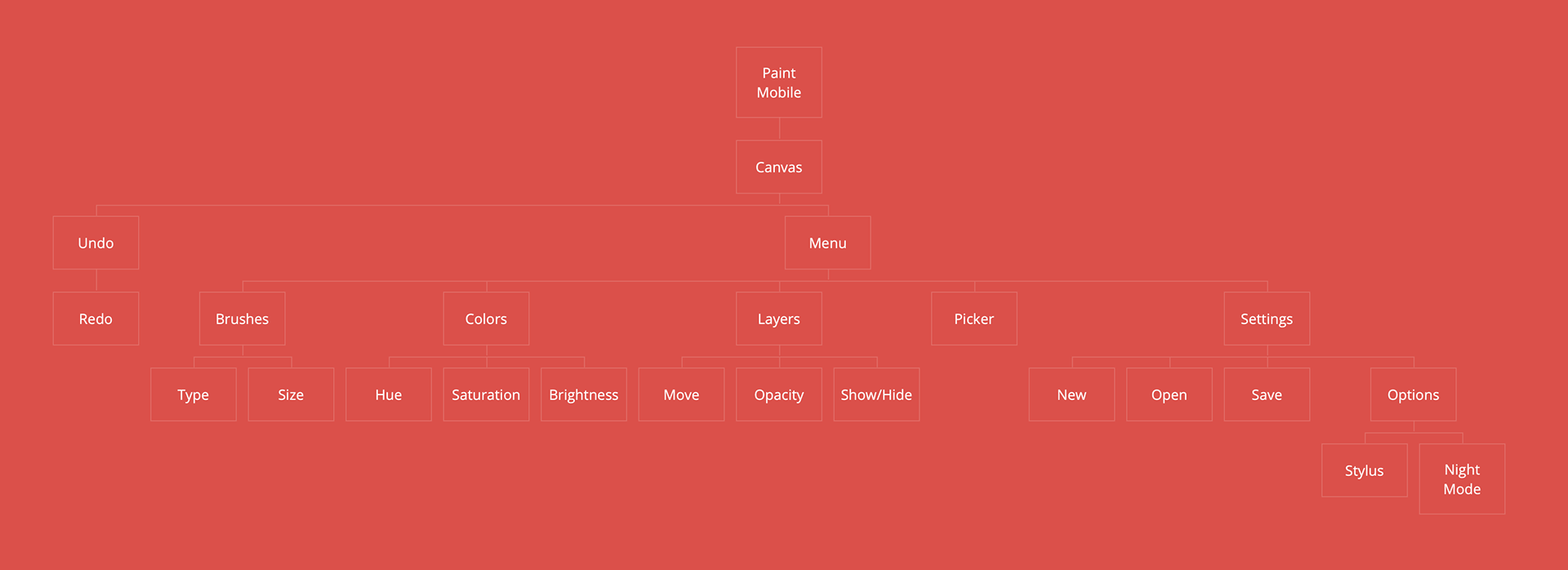
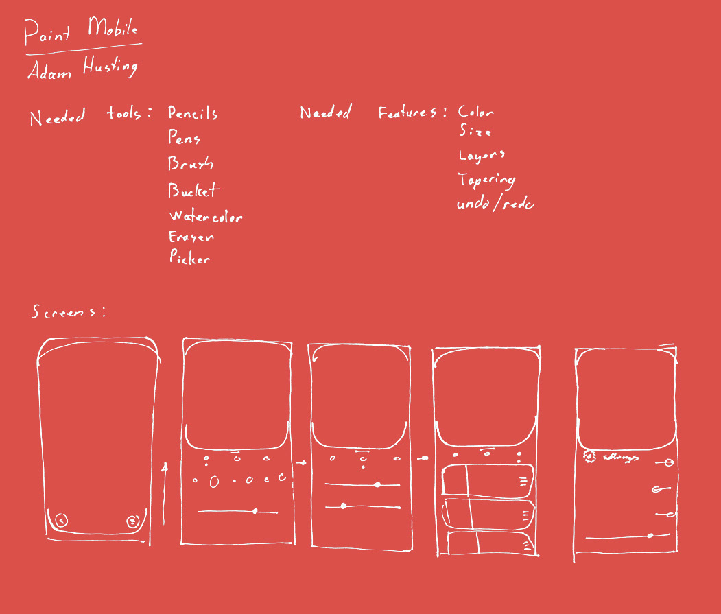
Iteration
Above is a map of the features that I deemed essential to the app. Below are some preliminary sketches I created.
Execution
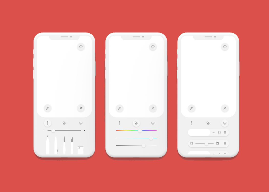
A simple interface
This app's focus is on minimalism in function. The function is not to provide the user with hundreds of tools to do advanced illustrations, but rather to provide a lightweight experience that encourages raw, diverse creativity rather than methodical planning and work.
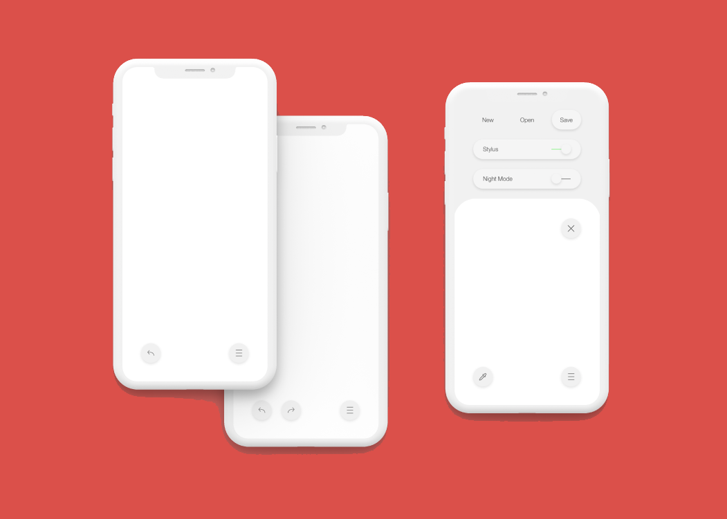
A readable layout
The menus disappear while the artist is drawing, and slide into view when needed. Sliders, options, and more are not locked behind multiple taps, but rather are displayed within easy reach.
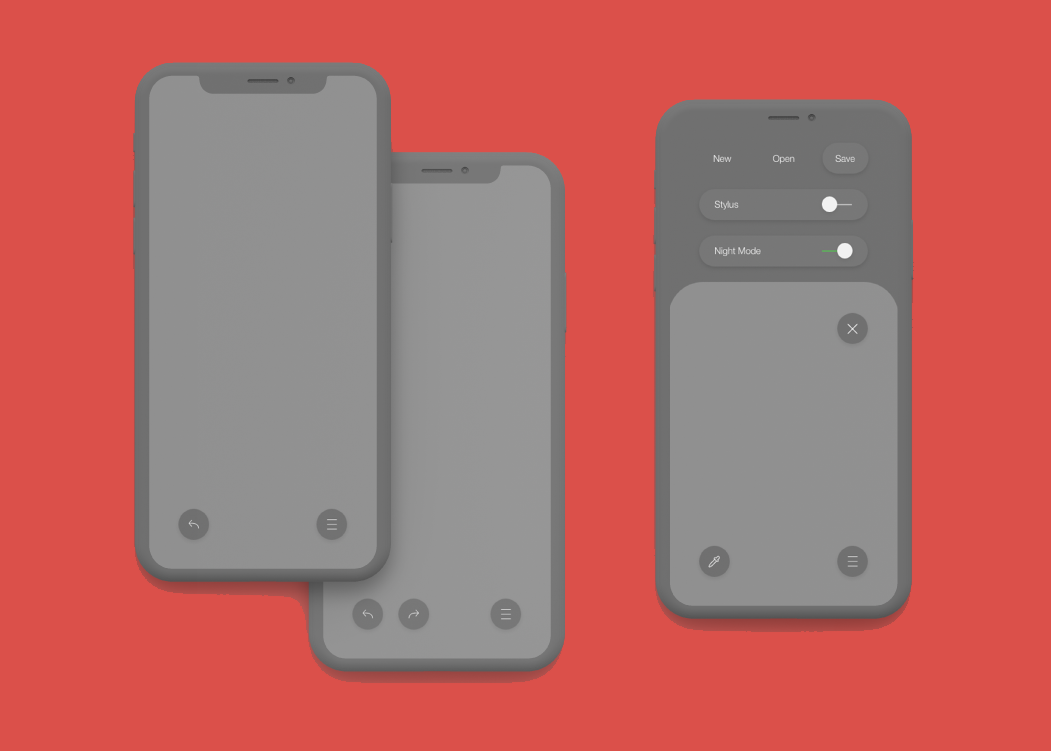
A darker hue
For those who have a creative at night, the UI can be toned down to decrease the blinding effect of the screen on their eyes.
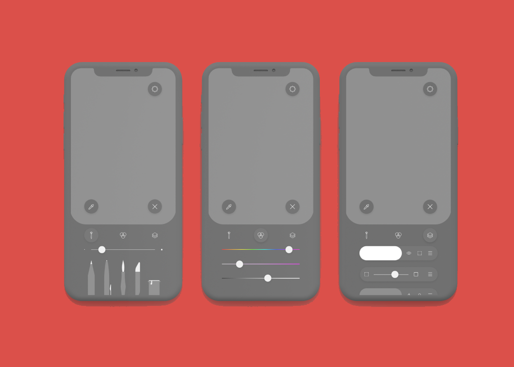
A consistent look
Even with a darker tone, the app still provides and easily readable user experience.
Conclusion
What I learned
I used this project as an opportunity to further exercise my understanding of material and fluent design. This app taught me how to thoughtfully organize menu options and settings as well as keep essential features in easy to reach configurations.
After completing this experiment, I feel that I am ready to tackle a much larger UI project.