
Presentation
The idea.
The Equestrian App enables people to connect with the individuals involved in the care of their horses.
Iteration
Understanding the market.
When I began creating preliminary concepts, I wanted to understand what kind of demographic would be using the app. I created some character profiles to explore the possible users of the app in an attempt to gauge what kind of style would best communicate with them.

Organizing a flow.
An app like The Equestrian offers a host of different tools for its users. The challenging part of having so many different options available to the viewer is that it may become too difficult to navigate to the feature demanded at the moment. I created a short map to help tackle this issue.

Picking a look.
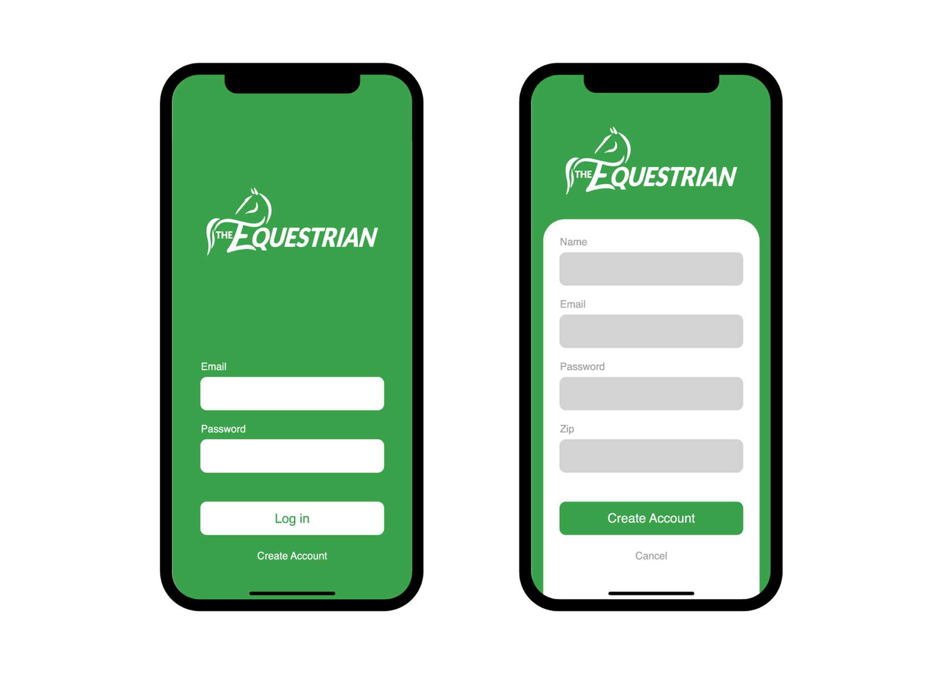
I realized quickly that the best way to go about designing an experience for this application was to craft the most minimal user interface possible. When a horse owner or trainer is checking on the status of their animal, it would be important to make sure it is as easy as possible to find the information they need. I chose the color green for the application because it represents themes like nature, trust, and hospitality. These themes are frequently found within the equestrian community.

Execution
A guideline.
The following images were presented to the client as a user experience and branding guide to follow for any future features that they would add in the future.
The app is in circulation today and is hitting new records for registrations and participation as a result of its new user interface.
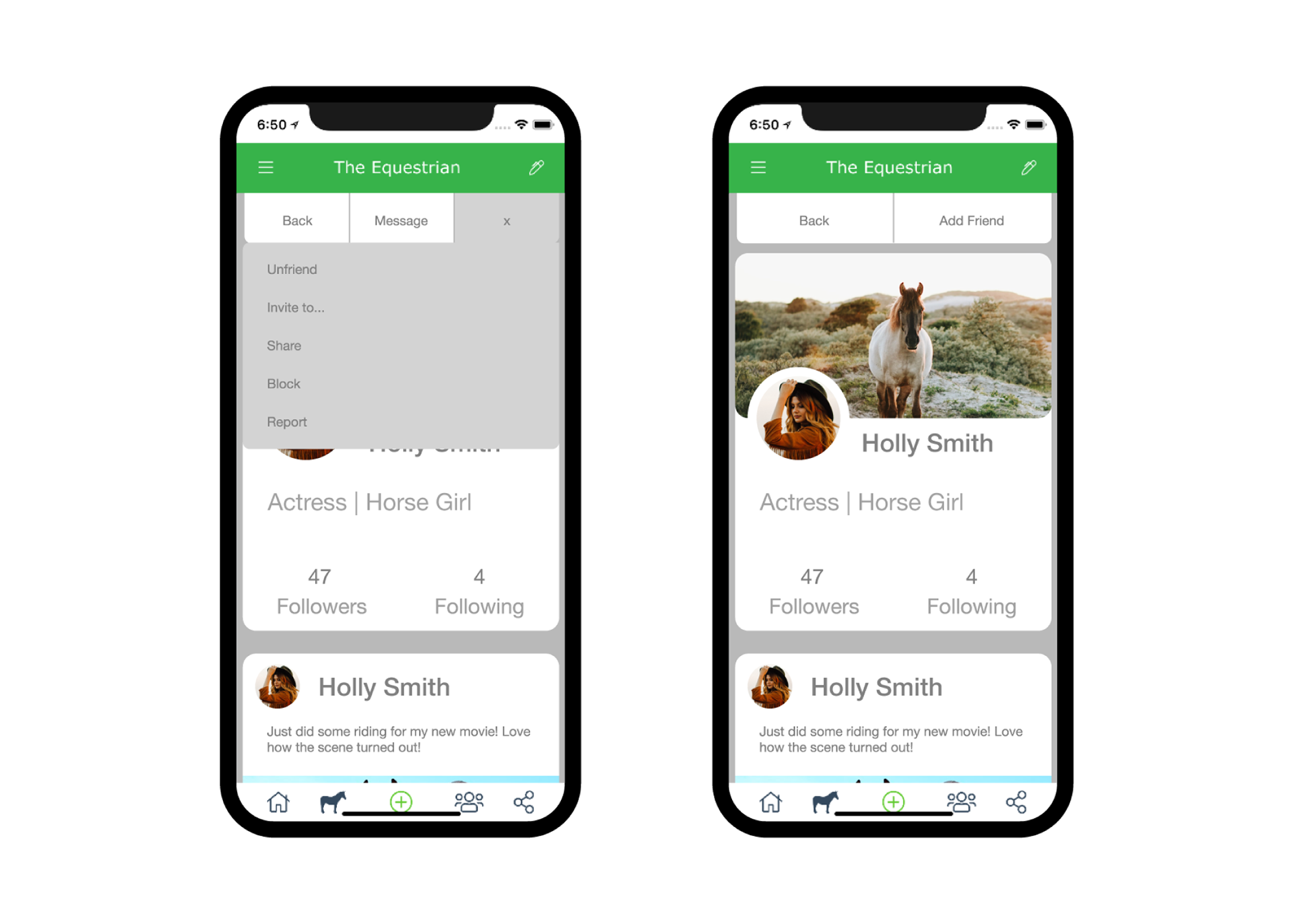
A smart profile.
Each user's profile page is crafted to look professional and simple. This way it is easy to view a person's information and posts.

The sale barn.
Another feature of the app is the ability to buy and sell horses, equipment, services, products, and more. I created a rather simple interface for the interaction. I prioritized the ability to quickly view and move between listings.

A clean filter.
When browsing listings in the marketplace, it is imperative that a user be able to sort for qualities and categories that they want. I designed the search and filter function with the same minimal attitude as before. I wanted to ensure that the audience would be able to quickly understand how to work the feature.
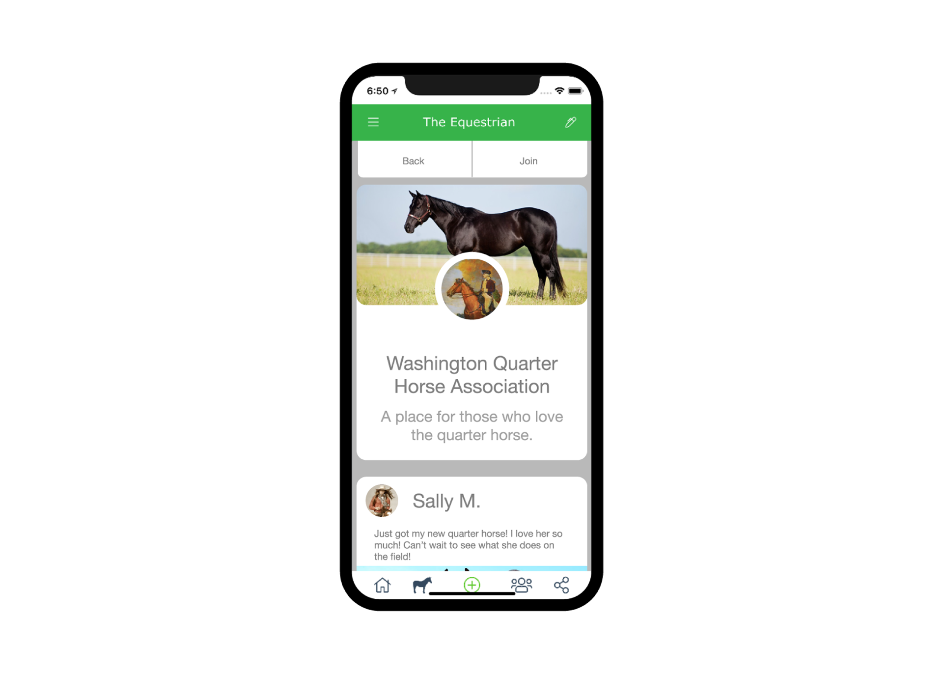
Business savvy.
The Equestrian has built in features for groups and organizations as well. These pages allow people to gather and share in common interests. These pages were designed to be easy to join and navigate, while still maintaining the overall theme of the rest of the app.
Conclusion
Summary.
The Equestrian is an app that is taking on a relatively unexplored market. In order to successfully gather the attention it requires, it needed to have a modern experience that the increasingly younger audience would be drawn toward.
What I learned.
As a student that was given the opportunity to take part and collaborate with seasoned, industry professionals, I learned about the importance of communication and iteration. Over the course of the project, my skills in planning and research greatly improved, and I enjoyed the opportunity to work with people who were just as passionate as me in delivering a complete, professional product.