Presentation
What is it?
This is a conceptual mobile app for King County in Washington state that is used to plan routes and manage tickets for the different modes of transportation that the county offers.
What is the problem?
The current app that King County uses is poorly designed, and can be clunky to use. It does not have much visual appeal, and can be hard to understand. Below is a picture of the current Transit Go application.
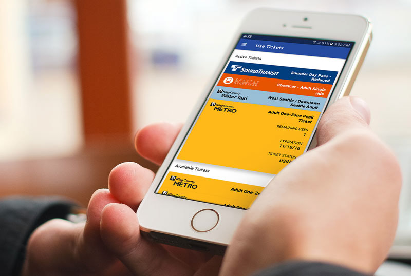
Image source: https://www.ilovekent.net/2016/12/06/metro-launches-transit-go-ticket-app-for-mobile-payments/
Iteration
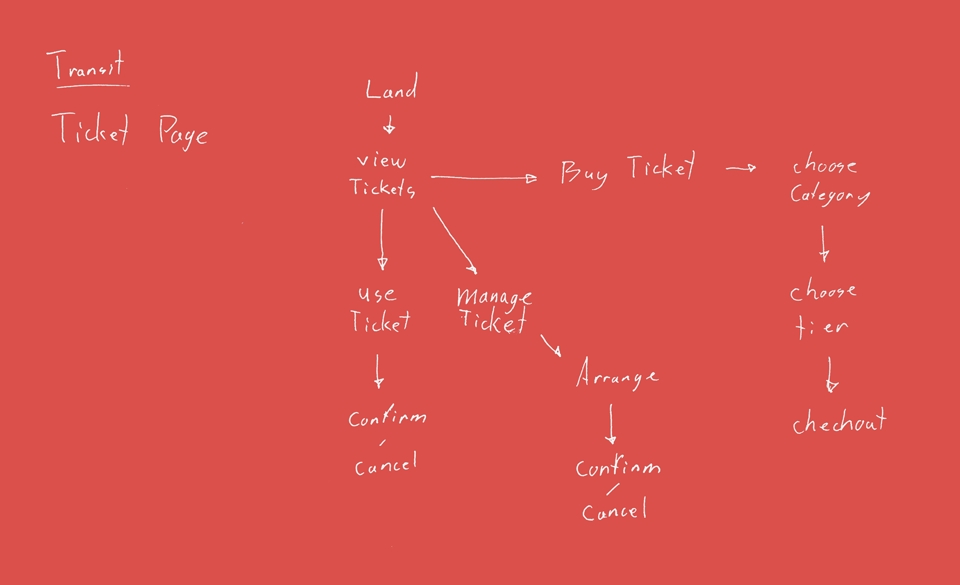
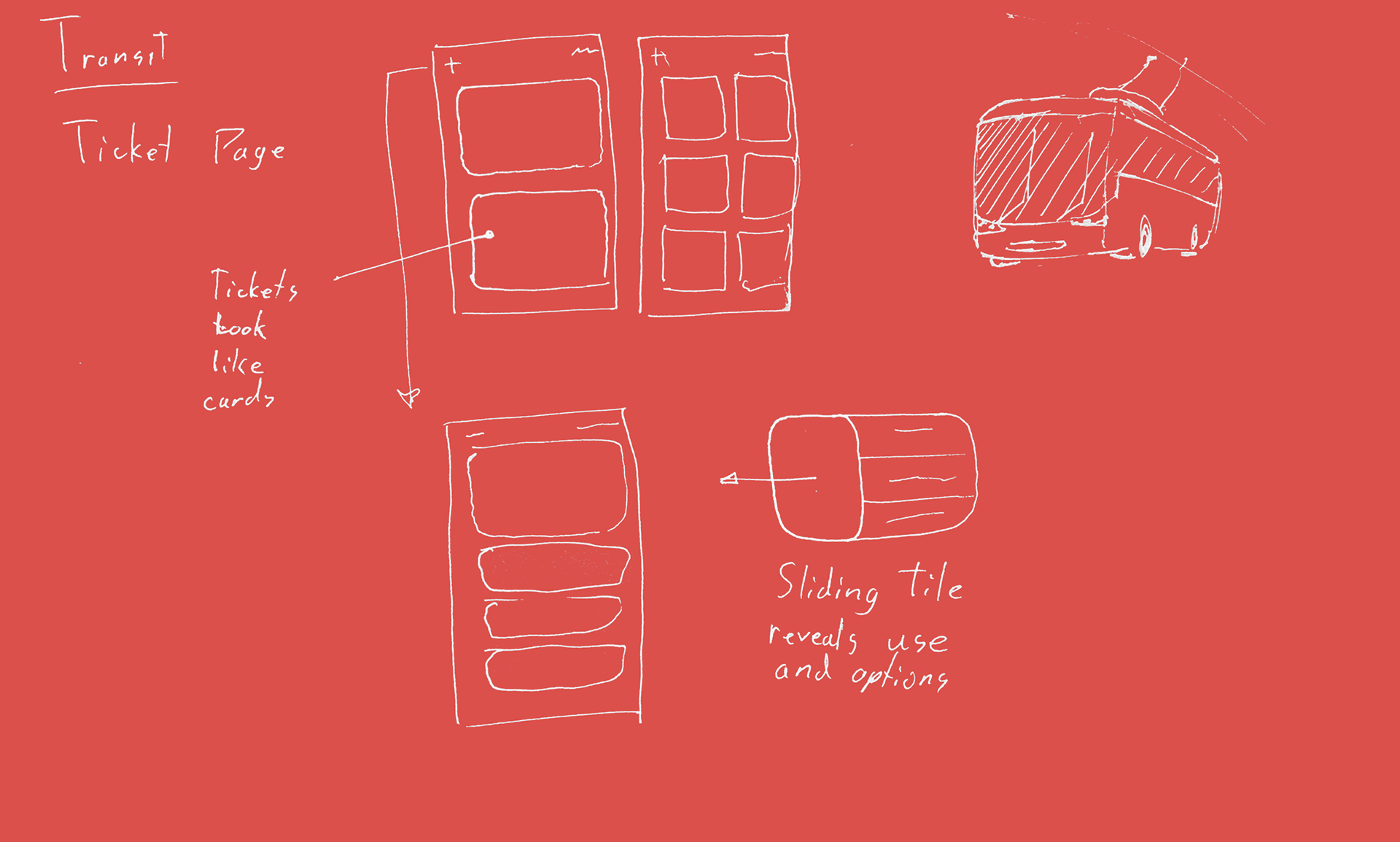
Mapping.
Below are some quick sketches and maps I made for my idea.
The solution?
In order to make the app easier to use. I stripped it down to its most basic features, and then focused on making those features more intuitive to execute.
The idea is speed.
When a person is looking to board a bus or other form of public transport, they want to have the least amount of interference as possible. I designed the user interface to have large elements that would be easy to use as interaction with the app becomes a habit.
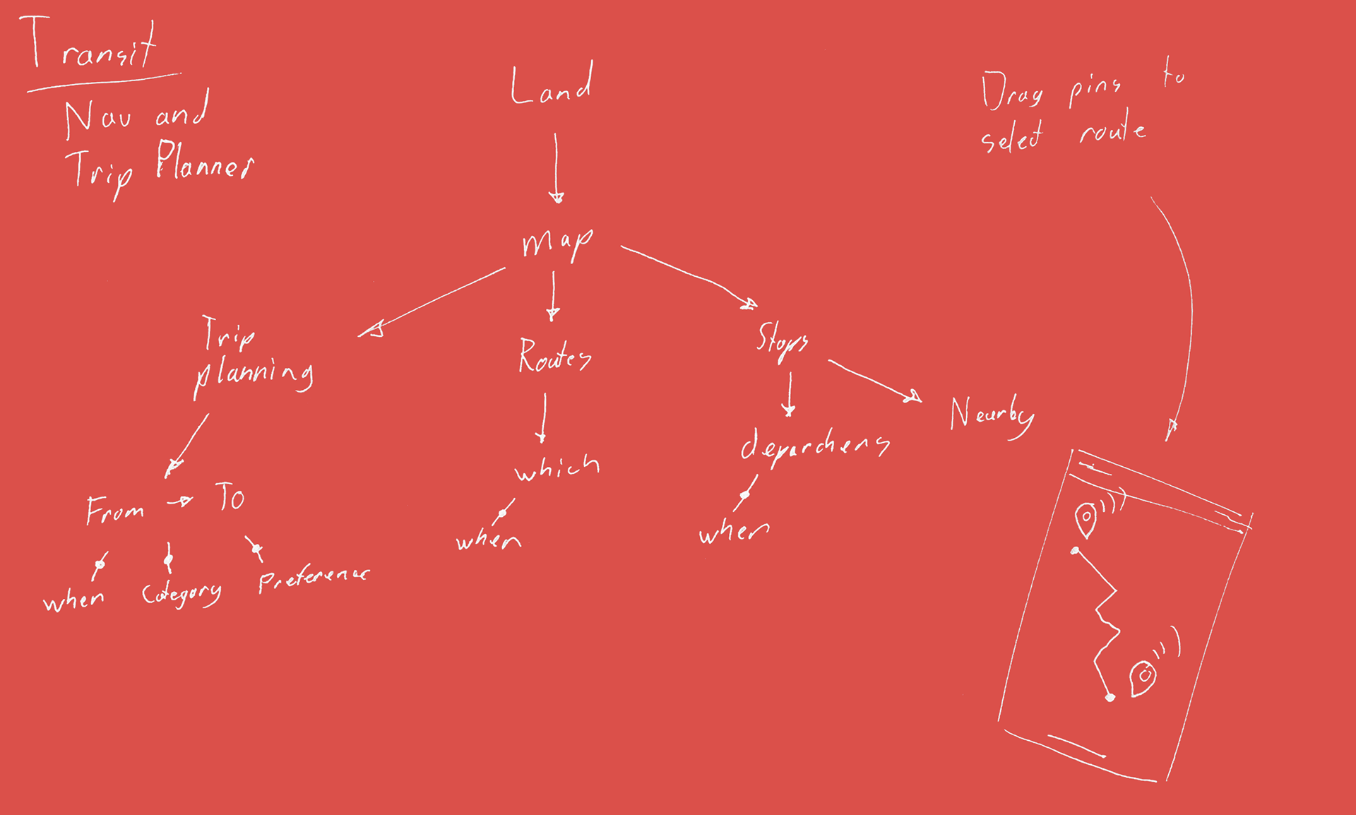
Routing shouldn't be hard.
When I used the app, I found that one of the most confusing features to understand was the routing functions. I drew up a plan of how I could better display these features. The original application made use of desktop features that weren't optimized for mobile displays.
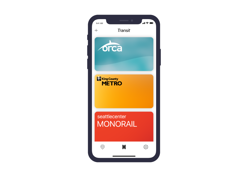
Easy to read.
I designed the virtual tickets to appear like "credit cards." The tickets are visually contrasting, making it easier to choose the correct ticket without a full glance at the screen.
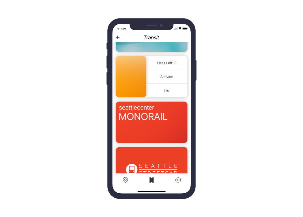
Easy to use.
To activate a ticket, or simply view remaining uses or other data, the commuter simply needs to swipe the "card" to the left. This displays the functions needed to continue without putting the user in danger of accidentally activating a ticket.
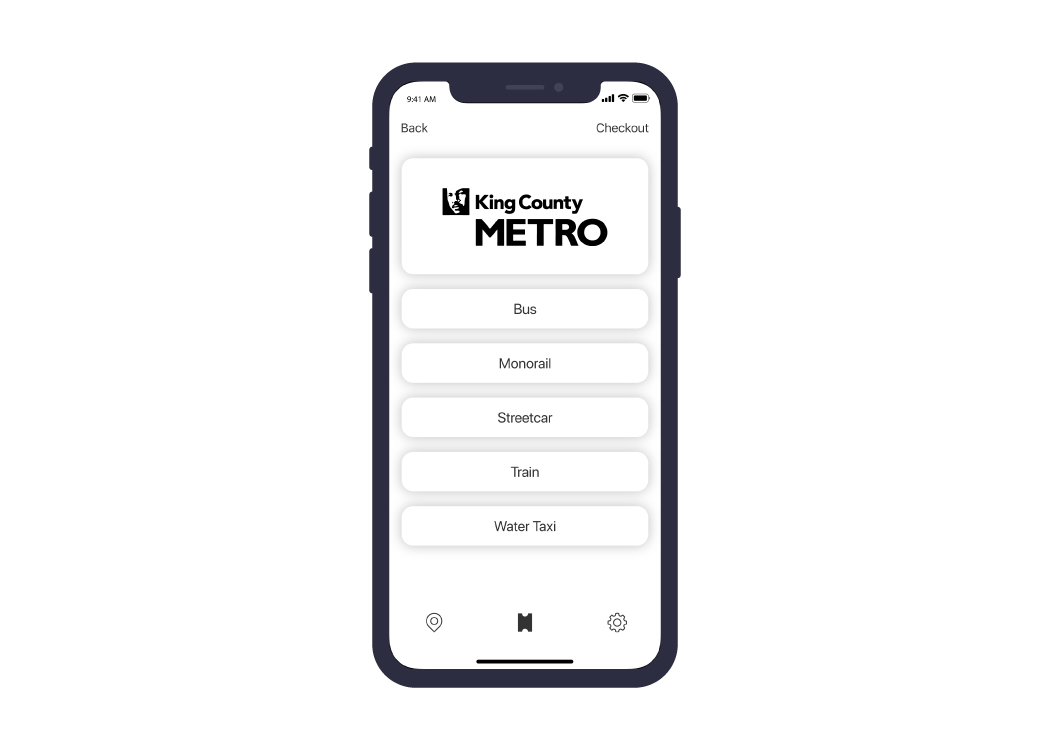
Easy to obtain.
Purchasing a ticket is much easier without an out-of-place drop down menu. Selecting a travel category is as simple as touching a button.
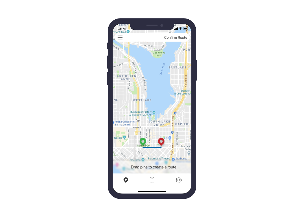
Plot your course.
The current app requires the user to manually type in an address from which to start and another address to travel to. With my app, the user simply needs to drag pins to the subsequent origin and destination. This streamlines the experience allowing for easy routing on a mobile experience.
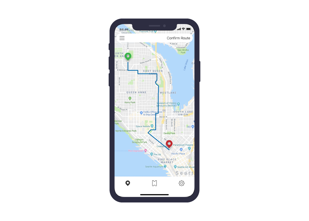
Relative ease.
As the pins drop into place, the application will automatically select stops near the pins' locations. Adjusting details like time and date can be accessed from a hamburger menu.
Conclusion
What I learned.
Sometimes, a designer's job isn't to create new ideas, it's to execute previous ideas better. Over the course of creating the mockups for this improved Transit app, I found that the difference between a functioning app and a beautiful experience is simply layout choices.
As a work into the future, I will pay special attention to how I choose to layout interfaces to ensure the best and most efficient use of the user's time. This will make the user more likely to use the app.